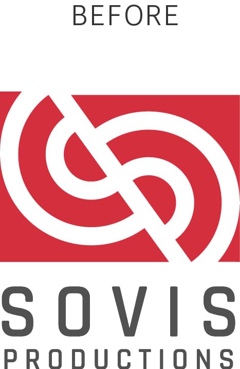
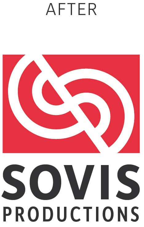
The Sovis Productions brandmark has been one of our favorite creations. The angled geometric shapes are timeless forms that make up SP’s initials & support Jordan’s personal values of quality & professionalism as a cinematographer.
Why Refresh This Logo?
There are many reasons why a company’s logo might need a refresh. Here’s a few of the major ones:
1 : It’s Outdated
2: It’s too confusing for
the target market
3: Inferior Execution
Brandmark Problems
1. When viewed from afar, these corner elements disconnect from the body of the logo, adding noise.
Think of when your black sweater has a few hairs on it. The details steal your attention away from the big picture.
2. The edges of the half-circles touch the edge of the rectangle, which confuses the eye. By adding a little margin to the left and right side, we properly contained Jordan’s initials inside the rectangle, bringing more attention to them.
The Existing Logo
Typography Problems
This font worked, at first, because it was condensed and allowed me to put a long word “Productions” in a limited space. However, since this font didn’t have a non-condensed version, we had to use the same font for “SOVIS” (there’s also not different weights for this font)
So, our options were:
A. Increase the size of SOVIS to fit on top, or…
B. Add space between letters (which is what we did).
“Michael did a phenomenal job refreshing our logo for Sovis Productions. He thinks of everything and executes it all wonderfully.”
Jordan S.
Sovis Productions


